The social media industry can never be complete without the mention of Twitter. For nearly a decade and a half now, Twitter has been one of the most popular social networking platforms. The site was founded in March 2006 by Jack Dorsey, Noah Glass, Biz Stone, and Evan Williams in San Francisco.
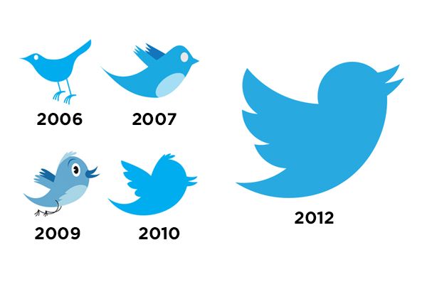
Also, the industry has undergone massive changes over the past decade. One of the most noticeable changes has been the evolution of Twitter’s logo. The original Twitter logo was a simple wordmark that spelled out the company’s name in green letters.
As of today, the popular microblogging social media platform has one of the most iconic logos in the tech industry. The bird logo is simple but memorable, and it has a rich history reflecting Twitter’s evolution as a company and product. You virtually find it in every form of social media.
In this article, we will look at the history of the Twitter logo and explore its meaning and significance.
And when you’re done check out our other Twitter guides:
- How to Delete Search History on Twitter
- Who Owns Twitter, When Was It Founded, History, And Timeline
- When and Who Created Twitter
Table of Contents
Twitter Logo Meaning
Twitter has come a long way since its humble beginnings in 2006. Back then, it was just a simple messaging service used by a small group of early adopters. The current Twitter logo is a blue bird with outstretched wings. This simple but iconic image has become synonymous with the Twitter brand. But what does it actually mean?
There are a few different interpretations of the Twitter logo’s meaning. One popular interpretation is that the bluebird represents freedom and independence. This makes sense, given that one of Twitter’s main functions is providing users with a platform to share their thoughts and opinions freely.
Another interpretation of the Twitter logo is that the bluebird represents limitless possibilities and hope. This also makes sense, given that Twitter is often used to spread positivity and raise awareness about important issues.
Whatever the true meaning of the Twitter logo may be, one thing is for sure – it is a highly effective and instantly recognizable logo that perfectly represents the brand.
First Official Twitter Logo

Jack Dorsey initiated the idea of Twitter in March 2006. At that time, the name of the company was Twttr. The first several official Twitter logos were designed by Biz Stone, the co-founder of Twitter. These logos were all wordmarks that spelled out the company’s name in different colors and styles.
The original logo was a simple wordmark spelled “TWTTR” in green letters.
Stone has said that he wanted the logo to be “instantly recognizable” and “reflect the company’s mission statement.” The first Twitter logo was certainly simple, but it wasn’t very memorable or iconic.
Before the public launch in 2006, the company hired Linda Gavin to design the first Twitter logo. She and her team were given just a few days for this task. The chosen design was a wordmark of the company’s name written in light blue. This had a white outline and was placed in a rectangle.
The Twitter Bird Icon
In 2010, the “Twitter” wordmark was given a new companion: a blue bird icon. Biz Stone called the icon Larry The Bird, which was inspired by the Basketball Hall of Famer Larry Bird. It was bought from the iStock website for just $15. However, brands/companies are not allowed to trademark or copyright stock images, so Twitter had to come up with something new to call their own.
Consequently, the image underwent a few tweaks and modifications until it became Larry The Bird we all knew and loved.
The Modern Bird

Larry The Bird lasted just two years before getting a makeover in 2012. The new bird was designed to be “sleeker, friendlier, and more playful.” It was also given a new name: “Twitter Bird.” The change was made to unify Twitter’s design language and make the brand more recognizable. What’s obvious is that the word “Twitter” is altogether taken out from the new logo. The bird looks like a hummingbird in flight and has long been a symbol of joy, freedom, and hope.
The bluebird is simple yet innovative. Once you see the Twitter logo, you need no other explanation. This goes on to define what a tweet is all about. Simple, precise, and to the point. This is likely why Twitter chose it as its logo in the first place. Blue is also one of the main colors in Twitter’s palette. It has been said that the bird also symbolizes Twitter’s mission of bringing people together. No matter where you are in the world, Twitter connects you with others. Whether you’re sharing news, thoughts, or simply just a funny meme, the bird is there to represent the global community that is Twitter.
The bird has continued to be an essential part of Twitter’s identity, appearing in various guises over the years. It represents so much more than just the social media platform.
For many, the bird symbolizes free speech, open communication, and connection. The bird has also become a popular mascot for all things tech-related. In a way, the little blue bird has come to personify the positive aspects of the connected world we live in today.
The company also announced that it wouldn’t redesign the logo anytime soon. It is one of the most widely known and loved logos in the world. And it all started with a little bluebird. Thanks, Larry! We owe you one.
Who Made That Twitter Bird?
The UK graphic artist Simon Oxley had created the logo and offered it for sale on iStockphoto. At the time, he had no idea that his work would become so iconic. A friend only told him about the breakthrough. After the purchase, Doug Bowman, Twitter’s creative director, disclosed the image had to be redesigned to the bird to ensure it was unique and did not infringe copyright laws.
The Twitter logo is transparent and can be placed on any color background. This is one of the many reasons why the Twitter logo PNG is one of the most popular logos today. You can find it just about anywhere.
Why the Twitter Logo Works
The simplicity of the Twitter bird logo is really what makes it so great. It’s easily recognizable and can be used in a variety of ways. The blue color is also very calming and has a universal appeal.
When you see the Twitter bird, you immediately think of tweets or social media in general. This is because the bird has become synonymous with the platform. It’s a great branding tool that has helped Twitter become one of the world’s most popular social media platforms.
Even though the Twitter bird logo has undergone some changes over the years, it has remained true to its original roots. The bird is still simple, blue, and recognizable. It’s a great example of how a logo can evolve over time while still maintaining its original meaning and purpose.
The brainwave behind this logo reflects the company’s mission statement, “to give everyone the power to create and share ideas and information instantly without barriers.” The bird in the logo is meant to represent freedom, hope, and possibility.
Twitter Logo Design Elements
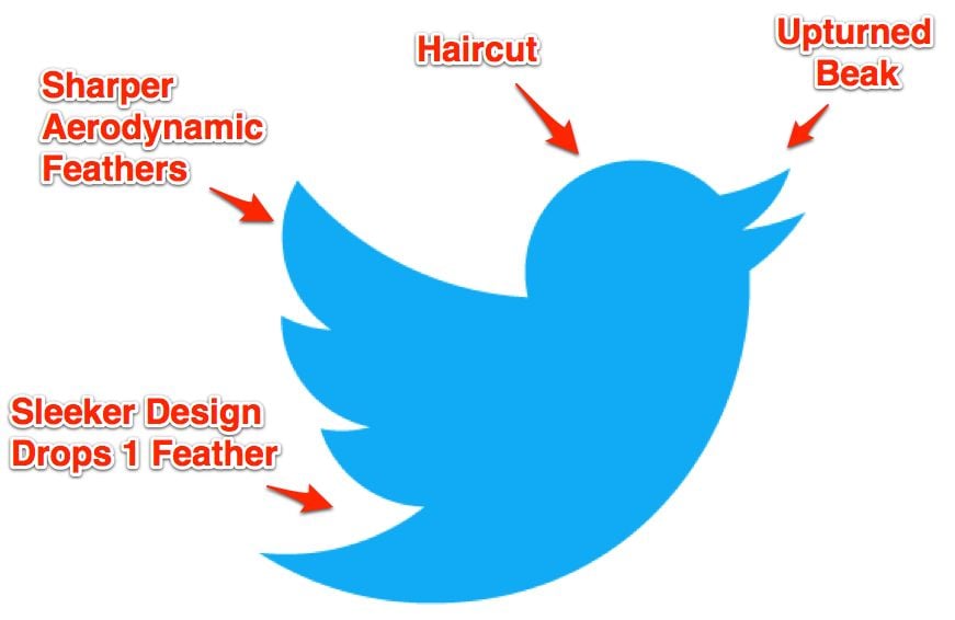
The modern Twitter bird doesn’t very much differ from Larry The Bird. However, it can be seen that every part of the logo is more refined. The geometry behind this logo is quite interesting. The Twitter bird is made up of 15 overlapping circles. The blue color of the logo is also significant. Blue is often associated with trust, loyalty, wisdom, confidence, and intelligence.
All of these qualities are important to Twitter and its users. The logo takes after the looks of a mountain bluebird, but with details like that of a hummingbird thrown in. Its beak is open and pointing to the sky, which could be seen as a symbol of freedom or ambition. Unlike the previous one, this bird has a smaller head with no fluff. Also, its feathers were reduced by one. We can’t attribute any font to the Twitter logo, as the wordmark no longer exists.
The bird’s tail is now in the shape of a V, which more closely resembles an actual bluebird tail.
The company wants its users to trust it with their personal information, and it wants to be seen as a wise and intelligent platform. The blue color in the logo also gives it a calming feeling, which is important given the fast-paced nature of social media.
The Twitter logo is a great example of a simple yet effective design. It’s easily recognizable and has a lot of meaning behind it. Twitter is a platform that is constantly evolving, and its logo reflects that.
Conclusion
There you have it – the history and meaning behind the Twitter logo.
Just when you thought Elon Musk couldn’t get any more eccentric, he goes and buys Twitter. The purchase was announced just as the close of the first quarter of 2022. The deal sent shockwaves through the social media world. While the details of the deal are completely ironed out, it’s clear that Musk is planning to shake things up at Twitter.
He has already indicated that he plans to install a new algorithm to eliminate trolls and spam accounts. Whether you love or hate Musk, there’s no denying that he’s a visionary thinker. And with Twitter under his control, we can expect even more big changes in the coming months.
However, one thing that has not changed is Twitter’s iconic logo. Whether you’re a fan of the new design or not, there’s no denying that it’s one of the most recognizable logos in the world.
Stay tuned for more informative blog posts like this one! Thanks for reading.
- Should You Buy Twitter (X) Followers in 2024? - May 23, 2024
- The Best Twitter Growth Strategies for 2024 - May 23, 2024
- How to Promote Your Tweets and Improve Twitter (X) Impressions - April 22, 2024

